The Failure of the Spreadsheet
For the first two years of the “model wars,” a shared Google Sheet was enough. We tracked parameters, context window sizes, and pricing updates for GPT-4, Claude 2, and the early Gemini iterations. It was a manual process, but it worked. One of our engineers would spend thirty minutes on a Friday morning updating rows, and the team would have a stable reference for the week’s client strategy sessions.
Then came April 2026. In the span of four weeks, the spreadsheet didn’t just become outdated; it became a liability. When Anthropic dropped Claude Opus 4.7 on April 16, followed immediately by OpenAI’s GPT-5.5 release, and then the surprise “Claude Mythos Preview” teaser, the logic of our rows and columns collapsed. By the time Google announced Gemini 3.5 Flash on May 19 at I/O, we realized we were spending more time formatting cells than analyzing the actual implications of the models.
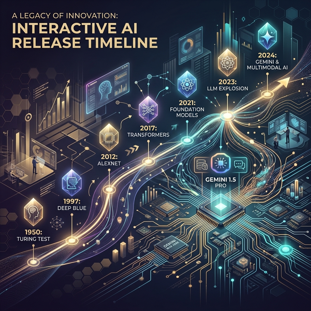
The pace of the ai release timeline has moved beyond manual curation. We didn’t need a prettier document; we needed a functional piece of infrastructure. This is why we stopped updating the sheet and started building a custom, interactive AI release timeline directly into the Tygart Media site using Antigravity and React.
The April/May 2026 Compression
To understand why a static tracker fails, you have to look at the density of releases in the second quarter of 2026. We are no longer in a “once every six months” cycle. We are in a “twice a week” cycle. The technical debt of staying current is mounting for every digital agency and AI operator.
- April 16, 2026: Anthropic releases Claude Opus 4.7. This wasn’t just a performance bump; it introduced a native “Artifacts 2.0” layer that changed how we architected frontend deployments.
- April 2026 (Late): OpenAI responds with GPT-5.5. The reasoning capabilities jumped, but the latency made it unusable for real-time agentic workflows.
- May 5, 2026: OpenAI follows up with GPT-5.5 Instant. This corrected the latency issues of the previous month, effectively deprecating the “standard” 5.5 for most of our production use cases within 15 days.
- May 19, 2026: Google releases Gemini 3.5 Flash. This model optimized the “long context” utility that we rely on for codebase analysis, offering a 2M token window at a fraction of the previous cost.
When you have tracking ai models as a core part of your operations, you can’t rely on a tool that requires a human to “decide” where a release fits. You need a system that visualizes the overlap, the deprecation cycles, and the specific utility of each branch.
Why a Custom Tool?
We looked at off-the-shelf timeline plugins and SaaS “roadmap” tools. Most of them are built for marketing—they prioritize “clean” visuals over data density. For an AI strategy firm, “clean” is often the enemy of “useful.” We needed to see the tygart media ai timeline as a heat map of capability jumps, not just a list of dates.
We chose to build a custom tool for three reasons:
- Component Integration: We wanted the timeline to pull directly from our internal Antigravity component library, ensuring that the UI matched our existing dashboard architecture.
- Programmatic Ingestion: We needed a way to feed the timeline via CLI tools rather than a CMS backend.
- State Management: In the heat of May 2026, we needed to filter by “multimodal,” “latency-optimized,” and “reasoning-heavy” models. Most third-party tools don’t support that level of granular state.
The Stack: React, Framer Motion, and Antigravity
The technical core of the timeline is a React application wrapped in Framer Motion for the layout transitions. We chose Framer Motion not for flashy animations, but for its layout projection capabilities. When a user filters the timeline from “All Models” to just “Claude 4.7 release” and its related iterations, the remaining nodes need to reorganize themselves without losing the user’s temporal context.
The design system is powered by Antigravity, our internal framework for building high-density utility tools. Antigravity allows us to define “tokens” for different model families (Anthropic, OpenAI, Google, Meta). This ensures that as the ai release timeline grows, the visual language remains consistent. A “Preview” release like Claude Mythos has a specific dashed-border treatment defined in the system, while a “Stable” release like Gemini 3.5 Flash uses a solid high-contrast fill.
// A simplified look at the release node structure
const ReleaseNode = ({ model, date, type }) => {
  return (
    <motion.div
      layout
      className={`node-${type}`}
      initial={{ opacity: 0 }}
      animate={{ opacity: 1 }}
    >
      <Tag color={getBrandColor(model.brand)}>{model.name}</Tag>
      <h4>{model.version}</h4>
      <p>{model.summary}</p>
    </motion.div>
  );
};
Data Ingestion: From Scraping to Structured JSON
One of the biggest failures of our initial spreadsheet was the “copy-paste” error rate. Reading a 4,000-word release note from Google I/O and trying to summarize it into a cell is a recipe for hallucination or omission. To solve this, we moved to an automated ingestion pipeline using Claude Code and the Gemini CLI.
When a new model drops, we pipe the official announcement text through a Gemini CLI script. The script is prompted to identify specific keys: Release Date, Model Name, Context Window, Pricing per 1M tokens, and “Primary Capability Change.” The output is a structured JSON object that we commit directly to the repository. The React frontend then consumes this JSON to render the timeline.
This “Operator Mindset” approach means that the person “updating” the timeline isn’t writing marketing copy. They are validating data that has been extracted directly from the source. It removes the “hype” and leaves us with the specs.
Technical Challenges: Performance and Overlap
Building an interactive timeline sounds straightforward until you hit a “Hot Week.” The week of May 4, 2026, was a nightmare for our layout engine. We had GPT-5.5 Instant, a mid-cycle update from Mistral, and the first leaks of the Mythos preview all hitting within 72 hours.
In a standard vertical timeline, these nodes stack on top of each other, creating a “scroll-hole.” We had to implement a collision detection algorithm in the React component. If two releases occur within the same 48-hour window, the timeline branches horizontally. This allows the user to see the “clash” of models visually. It reflects the reality of the market: these models are competing for the same headspace at the same time.
We also struggled with SVG performance. We initially tried to draw connecting lines between “parent” and “child” models (e.g., GPT-5.5 to GPT-5.5 Instant). As the timeline grew to over 50 nodes, the browser’s paint time started to lag. We eventually moved to a canvas-based background for the connecting lines, keeping the nodes as interactive DOM elements. It’s a bit more complex to maintain, but it keeps the interaction at 60fps.
Design Decisions: Usefulness Over Aesthetics
In the Pacific Northwest, we tend to favor restraint. We applied this to the UI. We stripped out the brand logos and replaced them with high-contrast color codes. We removed the “hero images” that usually accompany these releases. If you are an architect looking at our timeline, you don’t need to see a picture of a glowing brain; you need to see the context window and the date.
One of the most debated features was the “Impact Score.” We originally wanted to rank models on a scale of 1-10. We killed that idea in the second week of development. “Impact” is subjective. Instead, we added a “Primary Use Case” filter. If you’re building a coding agent, the “Impact” of Gemini 3.5 Flash’s 2M context window is much higher than a reasoning-heavy model with a 128k window. Our design allows the user to define what matters to them.
Failures in Automation
We aren’t afraid to show where we tripped. Our first attempt at the timeline was 100% automated. We had a CRON job that searched for “new model release” and tried to update the JSON automatically. It was a disaster.
On May 5, the bot picked up a parody post on X (formerly Twitter) about a “GPT-6 Super-Intelligence” and added it to the timeline. It took us six hours to notice and remove it. We learned that while extraction should be automated, verification must remain human. We now use a “Human-in-the-loop” (HITL) system. The Gemini CLI generates the draft JSON, but it requires a git commit by an engineer to actually go live. This balance is what keeps the tool reliable.
The Result: An Operator’s View
The interactive timeline has changed how we talk to clients. Instead of saying, “Things are moving fast,” we can show them the exact density of the claude 4.7 release cycle compared to the previous version. We can show them why we shifted their infrastructure from GPT-5.5 to GPT-5.5 Instant in a matter of days. It provides a visual justification for the agility we build into our systems.
It’s no longer a “project.” It’s a living part of the Tygart Media stack. It serves as a reminder that in the AI era, your documentation tools must be as scalable and automated as the models themselves.
What You Should Do Tomorrow
If you are still tracking AI updates in a spreadsheet or a Notion gallery, you are already behind. You don’t necessarily need to build a custom React app, but you do need to change your process.
- Step 1: Stop writing manual summaries. Use a CLI tool (Gemini or Claude) to extract the technical specifications from release notes. Create a structured format (JSON or CSV) that remains consistent.
- Step 2: Define your “Production Stack.” Don’t track every model; track the ones that actually affect your operations. If you aren’t using Llama 3 on-prem, don’t let it clutter your primary view.
- Step 3: Visualize the overlap. Whether you use a simple Mermaid.js chart in your internal wiki or a custom tool, you need to see when models are released in parallel. It helps you understand which “generation” of technology you are currently building on.
The chaos isn’t going away. The only variable is how much of it you choose to automate.
Related on Tygart Media: Claude 4.6 vs GPT-5 · Anthropic agent layer · AI operator’s stack.
Leave a Reply