• Long-form Position
• Practitioner-grade
Every organization has two kinds of knowledge. The documented kind — processes, policies, SOPs, training materials — lives in manuals and wikis. The other kind lives in people’s heads: the adjustments made without thinking, the thresholds learned from expensive mistakes, the pattern recognition that executes in a second but couldn’t survive a PowerPoint slide.
The first kind is easy to feed into an AI system. The second kind is what makes the organization actually work. And it almost never gets captured before it walks out the door.
This gap — between what’s written and what’s known — is where most enterprise AI implementations quietly fail. The system gets the documentation. It never gets the knowledge. The result is an AI that gives the same answer a new employee would give, while the 15-year veteran shakes their head and does it differently.
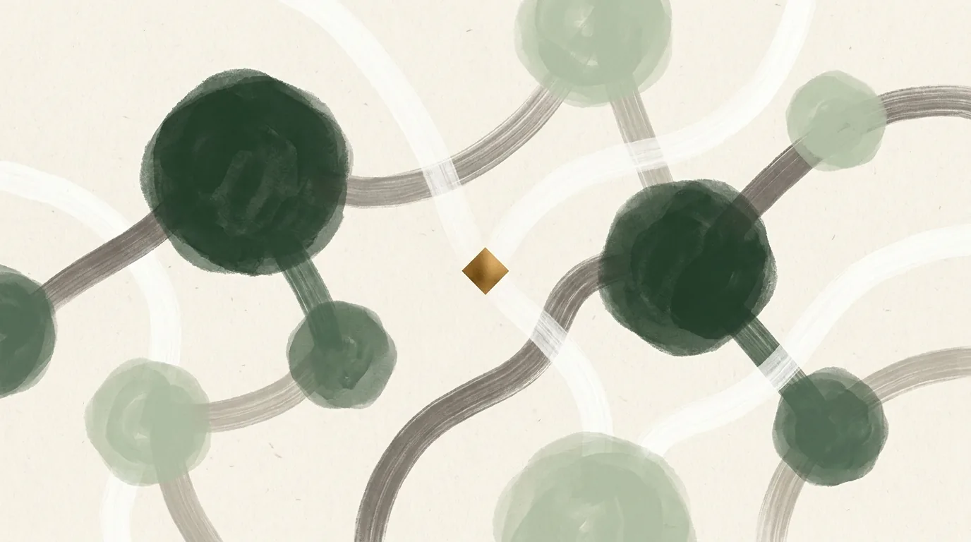
The Human Distillery methodology exists to close that gap. It is a structured extraction protocol for converting tacit knowledge into dense, structured artifacts — books for bots — that AI systems can actually use. Not summaries. Not transcripts. Knowledge concentrates: information-rich artifacts that encode relationships, decision logic, and confidence alongside the facts themselves.
This article is the methodology reference. It covers what tacit knowledge is and why it resists standard capture methods, the four-layer extraction protocol that surfaces it, the pivot signal lexicon that tells you when you’re close, what a knowledge concentrate looks like as a structured artifact, and where human judgment remains irreplaceable in the pipeline.
Why Standard Methods Don’t Work
The instinct when trying to capture organizational knowledge is to reach for one of three tools: a survey, an interview, or a documentation request. All three fail at tacit knowledge for the same reason: they ask people what they know. Tacit knowledge is knowledge people don’t know they know. It operates below the level of conscious articulation. You cannot survey it out of someone. You cannot ask them to write it down. You have to create the conditions under which it surfaces — and then recognize it when it does.
Forms and surveys capture what people think they do. Conversations capture what they actually do and why. The difference between those two things is the entire product.
A 20-year insurance adjuster asked “what’s your process for evaluating a water damage claim?” will give you the documented version: inspect the loss, review the policy, scope the damage, issue the estimate. This is accurate and useless. Ask them about a claim that went sideways and they will, unprompted, tell you that they always check the crawlspace first on older properties in this zip code because the contractor community there has a pattern of scope creep on foundation moisture that the initial inspection never catches. That’s the knowledge. It lives in the deviation from the process, not the process itself.
The Four-Layer Descent
The extraction protocol descends through four distinct layers in sequence. Each layer unlocks the next. Skipping a layer produces thin output. Rushing a layer produces performed output. The full descent, executed correctly, surfaces knowledge the subject didn’t know they were carrying.
Phase 0: Disarmament
Before any extraction begins, the status dynamic has to be neutralized. The subject needs to stop performing expertise for an evaluator and start explaining their world to a curious outsider. The difference in what comes out is dramatic.
The disarmament move: position yourself as someone who genuinely doesn’t know. “I’ve never seen a job like this — walk me through it like I’m shadowing you.” This does two things. It forces explanation of steps the subject considers so obvious they wouldn’t otherwise mention — which is exactly where embedded knowledge concentrates. And it signals that there’s no correct answer being evaluated, which reduces the filtering that kills tacit knowledge capture.
Open with failure. “Tell me about a job that went sideways” surfaces edge cases, exceptions, and judgment calls that success stories never reveal. People tell the truth in their failure stories. They’re not protecting anything.
Layer 1: Surface Protocol
The question: “What’s your process when X happens?”
What it gets: The documented version. What the subject would write in an SOP. What they’d tell a new hire on day one. Accurate. Insufficient. Necessary baseline.
Why you need it: The surface protocol establishes the frame. It’s the map. Everything that comes after is about finding where the territory diverges from the map — and those divergences are where the knowledge lives.
Layer 2: Exception Probing
The question: “When do you deviate from that?”
What it gets: The adaptive layer. The judgment calls that experience produces. The cases where the checklist gets ignored because the situation demands something the checklist can’t accommodate. This is the first layer where genuine tacit knowledge begins to surface.
The follow-up sequence: “And when does that happen?” → “How do you know it’s that situation?” → “What would you have done three years ago that you wouldn’t do now?” Each question peels back one more layer of accumulated judgment.
Layer 3: Sensory and Somatic
The question: “How do you know it’s that and not something else?”
What it gets: Pattern recognition so ingrained it operates below conscious awareness. The knowledge the subject has never verbalized because no one has ever asked them to. This is the hardest layer to surface and the most valuable thing in the concentrate.
What it sounds like: “The smell is different.” “The drywall feels wrong.” “Something about the way the insurance company rep is phrasing the emails.” These are not vague — they’re ultra-specific to a domain. The job is to slow down at these moments and press: “Describe the smell.” “What does wrong feel like compared to right?” “What in the phrasing specifically?” The subject usually thinks they can’t explain it. They can. They just haven’t been asked slowly enough.
Layer 4: Counterfactual Pressure
The question: “What would break if you weren’t here tomorrow?”
What it gets: The knowledge hierarchy. What actually matters versus what’s ritual. Most organizations don’t know which is which until the person who knows leaves. This layer surfaces the load-bearing knowledge — the things that if absent would produce visible failures, not just suboptimal outcomes.
The follow-up: “Who else knows that?” The answer is almost always “no one” or “maybe [one person].” That’s the knowledge risk. That’s also the product.
The Pivot Signal Lexicon
Proximity to tacit knowledge produces specific signals in conversation. Recognizing them in real time is the skill that separates a good extraction session from a great one. Miss these signals and you stay in Layer 1. Catch them and you descend.
| Signal | What It Means | The Move |
|---|---|---|
| “It’s hard to explain…” | The subject is about to verbalize something they have never articulated before. This is the most valuable signal in the lexicon. | Slow everything down. “Try anyway.” Do not fill the silence. Do not offer a simpler question. Wait. |
| “You just kind of know” | Layer 3 boundary. The subject is pointing directly at tacit knowledge they don’t know how to surface. | “Walk me through the last time you just knew. What did you notice first?” |
| Hedging and qualifiers | The subject is filtering. They have an answer but aren’t sure it’s acceptable to say. “Generally speaking…” “In most cases…” “It depends…” are all hedges. | “Off the record — what actually happens?” Or: “What’s the version you’d tell a colleague vs. what you’d put in the manual?” |
| Sudden energy or animation | You’ve touched something they care about. The subject’s pace increases, their posture changes, they lean in. This is a live thread to a knowledge cluster. | Follow it immediately. Drop the protocol. “Tell me more about that.” The protocol can resume. This thread may not come back. |
| Deflection to process | The subject is avoiding the judgment layer. When asked what they do, they tell you what the process says to do. Often accompanied by “the policy is…” or “we’re supposed to…” | “But what do you do when that breaks down?” The emphasis on ‘you’ reframes the question from institutional to personal, which is where the knowledge actually lives. |
| Pausing before a number | The subject is calculating from experience, not retrieving from documentation. The pause is the gap between “what the spec says” and “what I know from doing this 200 times.” | Ask for the number, then: “Where does that come from?” The answer to the second question is often the most valuable thing in the session. |
| Unprompted stories | The subject has moved from answering your questions to accessing their own knowledge map. Stories they tell without being asked are almost always pointing at something important. | Let it run. If the story ends without the embedded knowledge surfacing, ask: “What made that one different from a normal job?” |
The Knowledge Concentrate: What the Output Actually Looks Like
A transcript is raw. A summary is thinner in size but barely denser in information. A knowledge concentrate is smaller than either and more information-rich than both — because it encodes relationships, decision logic, and confidence alongside the facts themselves.
The schema for a knowledge concentrate has five components:
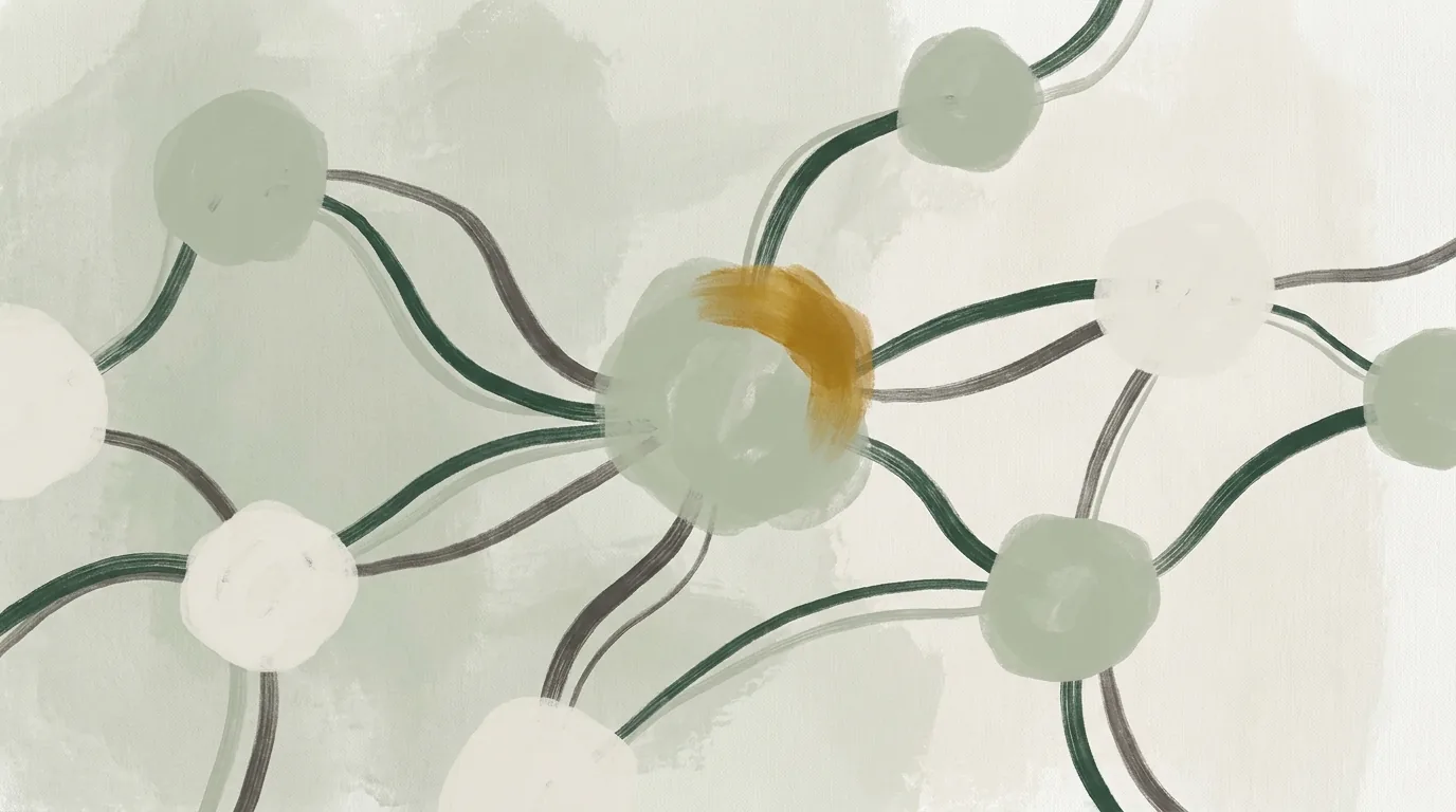
Entity graph. Every named concept, process, person-role, piece of equipment, and decision point that surfaces in the extraction, mapped as nodes with typed edges between them. Not a list — a graph. The relationships are the knowledge. The entities alone are just vocabulary.
Decision logic. Every when-then-because statement extracted from the session. “When the moisture readings are above X in a crawlspace with Y flooring type, we always do Z because A.” Structured with confidence scores: is this firsthand knowledge, observed pattern, or secondhand information?
Benchmarks. Every number that surfaces in extraction — thresholds, timelines, costs, rates, counts — with context, source count, and variance. A benchmark from one interview has low confidence. The same benchmark confirmed across six interviews in the same market has high confidence and is ready to be used as ground truth.
Tacit signatures. The things that are hard to explain — captured as best as they can be verbalized, with a confidence flag that signals to the AI system consuming them: this is approximate. This is the residue of knowledge that the extraction process got close to but couldn’t fully surface. It’s still valuable. It tells the AI where human judgment is concentrated.
Provenance. Traceable but anonymized. How many sources contributed to each claim. Whether a given piece of knowledge is individual or cross-validated. What industry and market it came from.
An AI system consuming a knowledge concentrate in this format doesn’t just know facts — it knows which facts to trust, how to chain them into decisions, and where the knowledge is thin enough that human judgment should be called in.
What the App Can Do and What It Can’t
The four-layer protocol and the pivot signal lexicon can be partially codified. A stateful conversational agent — not a chatbot, a genuinely stateful system that maintains a running knowledge map of what’s been surfaced and what’s still needed — can execute the question sequences, detect linguistic pivot signals, navigate domain-specific question libraries, and run the processing pipeline from transcript to structured concentrate.
What it cannot do is the thing that makes the difference between a good extraction and a complete one:
It cannot read the half-second of hesitation before an answer that signals the subject knows more than they’re about to say. It cannot decide, in the middle of an unprompted story, that this tangent is the most important thing in the session and the protocol should be abandoned to follow it. It cannot calibrate trust — cannot sense whether the subject is performing for the recording or actually sharing, and adjust accordingly. It cannot distinguish a valuable tangent from genuine noise in real time.
These are not gaps that better models will close. They are inherently relational and embodied. They require a human who is genuinely present in the conversation, not processing a transcript of it.
The honest architecture for a distillery operation is therefore tiered. The app handles extraction volume — the sessions where the knowledge is relatively accessible, the domain is well-mapped, and the question library is sufficient. The human handles the sessions where the stakes are highest, the subject is guarded, or the knowledge being sought is at the outer edge of what can be verbalized. And the human is always the quality gate on the final concentrate, regardless of which path produced it.
Why This Works in Any Industry
Tacit knowledge is not a property of any particular field. It is a property of human expertise at depth. Wherever humans have been doing something long enough to develop judgment that exceeds documentation — which is everywhere — the distillery protocol applies.
The domain changes the question library. The pivot signals are universal. The four-layer structure works in restoration, in legal practice, in medicine, in financial services, in manufacturing, in competitive sports coaching, in culinary production. Any field where experience produces something that training cannot replicate is a field where a knowledge concentrate has value.
The buyers are the organizations trying to make that knowledge portable. The AI system that needs to give the same answer a 20-year veteran would give. The consultant whose insights live only in their head. The franchise trying to replicate the judgment of its best operators across 400 locations. The company that just lost its most important employee and is only now discovering what they actually knew.
The product is not content. It is not a report. It is a structured knowledge artifact that makes someone else’s irreplaceable expertise replicable — at least partially, at least for the cases the documentation currently handles worst.
That’s the distillery. Extract. Distill. Deploy.
Frequently Asked Questions
How long does a single extraction session take?
A full four-layer descent with one subject takes 60–90 minutes. Rushing below 45 minutes consistently produces shallow output — the session ends before Layer 3 is reached. Three to five sessions with different subjects in the same domain produces a concentrate with enough cross-validation to have meaningful confidence scores on the decision logic and benchmarks.
What industries is this most applicable to?
Any industry where experience produces judgment that documentation can’t replicate. The highest-value applications are in fields with expensive mistakes (medical, legal, engineering), fields with long apprenticeship periods (skilled trades, finance, consulting), and fields where the knowledge is currently locked in one or two people (most small and mid-size businesses).
How is this different from a McKinsey-style knowledge management engagement?
Traditional knowledge management captures process documentation — what should happen. The distillery protocol captures judgment documentation — what actually happens, and why, and when the standard answer is wrong. The output is structured for AI consumption, not human reading. The concentrate is designed to be queried, not read.
What happens to the concentrate after it’s produced?
The concentrate is delivered to the client for ingestion into their AI infrastructure — as a RAG knowledge base, as fine-tuning data, as a reference layer for their AI assistant, or as structured context for their customer-facing AI systems. The format is designed to be immediately usable without further transformation. The provenance metadata ensures the client knows which claims to trust at what confidence level.
Can the extraction protocol be deployed without a trained human interviewer?
Partially. A well-built stateful conversational agent can execute the question sequences, detect linguistic pivot signals, and run the processing pipeline. What it cannot do is the real-time relational judgment that surfaces the deepest knowledge — the hesitation reading, the trust calibration, the decision to abandon the protocol and follow an unexpected thread. For accessible knowledge in well-mapped domains, the app is sufficient. For the knowledge closest to the surface of human expertise, the human remains in the loop.
Human Distillery Knowledge Cluster
- Books for Bots: What a Knowledge Concentrate Is and How It’s Built
- Replacing the Interviewer: What the App Can and Cannot Do
Related: Build the System Around the Behavior, Not the Tool — the design philosophy this methodology embodies.