Watch the walkthrough: Video embed pending (source file 11.5 MB exceeds the WordPress MCP upload ceiling of 8 MB; library upload / unlisted YouTube handoff open). Walkthrough file: google-pics-test-drive.mp4 (4:18) in the Drive pack.
Google has a new toy, and it’s hiding in the last place you’d look. Google Pics — reachable at pics.new — lives inside the Google Docs image editor, of all places. It’s an AI image studio aimed squarely at one job: generating and refining branded visuals, the kind of merch mockups and product shots you’d normally brief a designer on. No announcement fanfare that I could find. So I did what I always do with a new Google surface: I took it for a proper test drive, everything branded Tygart Media, and wrote down exactly what happened.
What it is
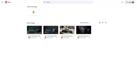
Pics is Gemini-powered image generation wrapped in a purpose-built editor. You start a new image from the Pics home screen, describe what you want, and get back images in about ten seconds. The documents autosave to Google Drive like any other Google file, there’s a full version history with undo and apply controls, and an export menu offering the original size plus 2K and 4K upscales.
The interface will feel familiar if you’ve used any Google creative surface: a prompt bar at the bottom (“Edit this image with Gemini”), a Style button, aspect-ratio controls, and a share button up top. There’s also a templates surface on the home screen, which I’ll come back to — not fondly.
How I tested it
Four projects. Ten generations. Every generation took between eight and eleven seconds — genuinely fast, fast enough that iterating feels conversational rather than transactional. All branding was Tygart Media throughout: white “TYGART MEDIA” text treatments on apparel, because if there’s one thing AI image generators have historically been terrible at, it’s rendering text on products. That was the thing I was really there to check.
Test 1: The merch package
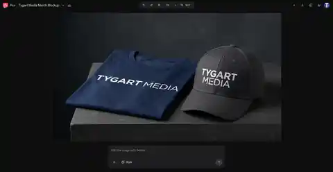
First up: a corporate merch package. Navy t-shirt, folded flat, next to a matching cap — the kind of shot you’d put on a careers page or a client gift announcement. First generation landed clean: white Tygart Media text on both pieces, believable fabric, believable lighting.
Then the refine test. I asked it to change the cap to charcoal gray and keep everything else. It did — same shirt, same composition, new cap color, logo intact on both items. That’s the moment Pics stopped being a demo and started being a tool: targeted edits that respect the parts of the image you didn’t ask to change.
Test 2: Workwear for the restoration crowd
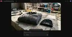
This one’s close to home. A charcoal work jacket and black beanie on a concrete slab, job-site setting — truck and drying equipment in the background. This is the exact visual language of the restoration industry: the gear your crews actually wear.
Two things stood out. First, the embroidery-style rendering held up — white and orange Tygart Media branding on the jacket read as stitched, not pasted on. Second, and this genuinely made me laugh: the model invented a tagline. “AI-first restoration marketing,” stitched right under the logo. I didn’t ask for it. It’s on-brand enough that I’m slightly annoyed I didn’t think of it first.
Test 3: The single hero item
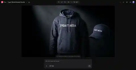
Third test: one product, hero treatment. A premium heavyweight hoodie with a white chest print and a matching navy cap, staged under a dark studio spotlight. Dramatic, product-page-ready.
Here’s the part worth knowing: what you’re looking at is the end of a journey. This image started life as a charcoal hoodie on a light gray background. Three rounds of refinement turned it into this — and every round is where the real story of Pics lives.
The refine loop is the real story
Generation is table stakes now — every model does it. What separates Pics is what happens after the first image. The refine loop works like this: describe a change in plain language, get four new variants in about ten seconds, pick one or hit undo. There’s a visible version history, so you can always step back to an earlier state. Apply is explicit. Nothing happens to your image that you didn’t ask for.
I stressed it deliberately. On the hoodie: round one, charcoal to navy — logo held. Round two, add a matching navy cap — composition held. Round three, light gray background to dark studio spotlight — everything held. On the merch package: the shirt went through a colorway change mid-stream without breaking the scene.
Across every round of every test, the brand text never degraded once. Not a smeared letter, not a dropped word. If you’ve watched AI fumble text on a t-shirt for the last two years, you know how unusual that is.
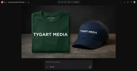
The thing that actually matters: brand text holds
Let me put a finer point on this, because it’s the whole ballgame for commercial use. AI image generators have always mangled text — especially short brand names rendered at an angle on fabric. It’s the tell. It’s why AI mockups have stayed in the “concept only” bucket.
Across ten generations and multiple refinement rounds, “TYGART MEDIA” rendered correctly every single time. On a folded tee. On a cap. As embroidery on a work jacket. Through color changes and scene changes and added objects. I want to be precise about what I’m claiming: this is generated brand text holding, not a supplied logo file surviving — I didn’t test uploading our actual logo artwork (the upload flow exists, via computer, Drive, or Photos, but I had no logo file handy). Within that scope, the text consistency is the best I’ve seen from any generator.
Export and the product surface
When you’ve got the image you want: the export menu offers the original size plus 2K and 4K upscales. I didn’t verify an actual file download in my test session, so treat the upscale quality as unconfirmed until someone runs it. Aspect-ratio switching is built in (I worked in 16:9 throughout), Drive autosave means you never lose work, and the standard Google share button is up top.
Rough edges
Honest accounting, because a test drive that only praises isn’t a test drive:
- The Style button appears dead. Clicking it did nothing in my session. For a button sitting front and center in the prompt bar, that’s a bad look.
- Templates are a ghost town. The templates surface on the home screen feels like a placeholder someone forgot to finish.
- One zoom glitch. Deep in a transform preview, the text briefly rendered as “TYGAIT IMEDIA” — the classic AI text scramble, caught in a preview frame. The final renders were all correct, but it’s a reminder that the underlying model still has the old failure mode lurking underneath.
- No paywall encountered. Worth stating plainly: in a full test session, I never hit a quota warning or a payment prompt. Whether that’s launch generosity or the actual pricing model, I don’t know.
Verdict
Google Pics is genuinely good at one specific thing: fast, branded merch concepts. Pitch decks, social creative, “what would this look like” mockups for clients — the turnaround from idea to believable visual is under a minute, and the brand-text reliability means the outputs are actually usable, not just directionally suggestive.
It is not a designer replacement. When the exact logo artwork matters — vector precision, color matching, print-ready files — you still need the human and the source files. Pics doesn’t claim otherwise; it’s a concepting tool with unusually good text rendering, not a production pipeline.
But as a concepting tool? For a restoration contractor who wants to see their brand on crew gear before ordering a hundred jackets, or an agency that needs ten merch directions by tomorrow morning — this is the fastest path I’ve found from “imagine” to “look at this.”
Vince takes the mic
Every Tygart Media article gets the Vince treatment. Ladies and gentlemen — Vince.
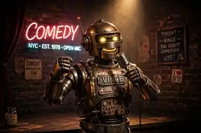
[Vince roast audio pending library upload — vince-roast-pics.mp3 in Drive pack]
Tested September 25, 2026, in the live Pics editor on a standard Google account. Ten generations across four projects, ~8–11 seconds each. No paywall or quota encountered during testing.
Leave a Reply