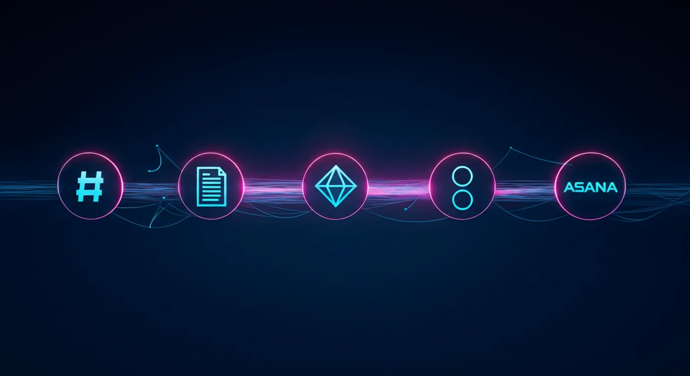
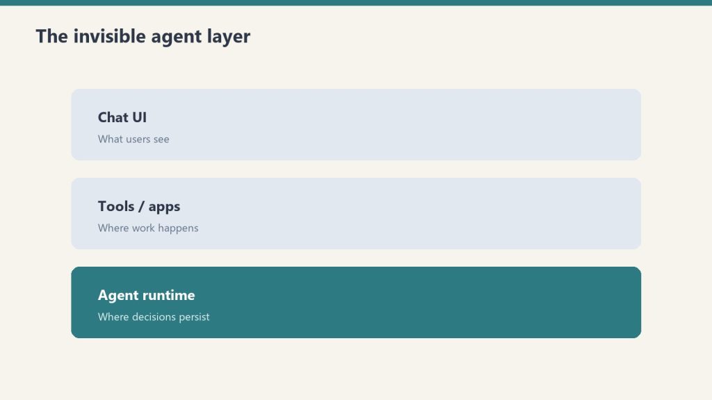
Claude Managed Agents is the product. Slack, Notion, Jira, and Asana are just the interface. Anthropic is building the invisible execution layer that powers the next generation of enterprise software.
Last refreshed: October 20, 2026 (Pacific)
There is a pattern emerging in enterprise AI that most people are reading wrong. They see Anthropic launch Claude Tag in Slack and think “chatbot upgrade.” They see Claude show up inside Notion and think “productivity feature.” They see AI agents appear in Jira and Asana and think “automation plugin.”
They are missing the architecture underneath all of it.
Anthropic is not building a better chatbot. It is building the invisible agent runtime that sits beneath every collaboration tool your team already uses. The company’s Claude Managed Agents (CMA) platform — launched in public beta on April 8, 2026 — is the infrastructure layer that makes this possible. And the speed at which partners are embedding it tells you everything about where enterprise software is heading.
What Claude Managed Agents Actually Is
Claude Managed Agents is a set of composable APIs for building and deploying production AI agents on Anthropic’s cloud infrastructure. The service handles sandboxed code execution, session persistence, credential management, scoped permissions, and end-to-end tracing — all the operational complexity that previously kept agents stuck in proof-of-concept limbo.
The architecture rests on three primitives: the Agent (configuration and behavior), the Environment (sandboxed execution), and the Session (the event log that tracks everything the agent does). What makes this interesting architecturally is how Anthropic decoupled the “brain” from the “hands.” Claude’s reasoning runs on Anthropic’s own infrastructure while the code execution sandbox spins up independently — and in parallel. The brain starts reasoning immediately while the sandbox provisions, delivering roughly 60% faster time-to-first-token at the p50 level and over 90% faster at p95, according to Anthropic’s engineering team.
Pricing follows a transparent model: standard Claude API token rates plus $0.08 per session-hour of active runtime during the current beta period. Runtime is measured to the millisecond and only accrues while the agent is actively executing — idle time waiting for input or tool confirmations does not count.
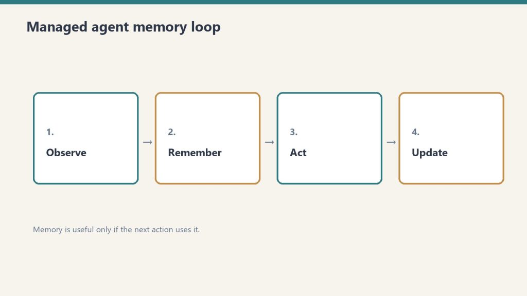
For teams that need to keep execution inside their own perimeter, CMA supports self-hosted sandboxes through partners including Cloudflare, Daytona, Modal, and Vercel, or custom VPC deployments. MCP tunnels allow agents to connect to private Model Context Protocol servers inside your network without exposing them to the public internet. A Vaults system keeps credentials out of the sandbox entirely using envelope encryption. And a feature called Dreaming runs scheduled reviews of past sessions to curate agent memory — essentially letting agents learn from their own operational history.
The Embedded Layer: Where CMA Actually Lives
The real story is not the infrastructure. It is where that infrastructure shows up. In the ten weeks since CMA launched, Anthropic has embedded its agent runtime inside the collaboration tools that enterprises already depend on. This is not a roadmap — these integrations are live or in active beta.
Slack: Claude Tag as Persistent Team Member
Claude Tag, launched in late August 2026, replaces Anthropic’s original Claude in Slack integration with something fundamentally different. This is not a chatbot you summon with a slash command. It is a persistent AI team member that lives in your channels, builds memory across conversations, and can take initiative through what Anthropic calls “ambient mode” — proactively surfacing information, following up on forgotten threads, and keeping teams updated across the organization.
Claude Tag is multiplayer by design: one Claude identity per channel, accessible to everyone, with the ability to hand off half-finished tasks between team members. It launched on Claude Opus 4.8 and now runs on Claude Opus 5.5 (see our Claude Tag pricing guide). And internally, Anthropic reports that Claude Tag is already approving and incorporating 65% of the code changes their product team submits. The existing Claude in Slack app will be retired on August 3, 2026. Claude Tag is available on Enterprise and Team plans.
Notion: Claude as External Agent
On May 13, 2026, Notion launched its Developer Platform version 3.5, which introduced the External Agents API. This API lets AI agents — including Claude — operate inside your Notion workspace as first-class participants. They can read pages, write to databases, create tasks, trigger automations, and be @-mentioned directly in documents. Claude operating through this API can chain actions together: read a project brief, check the task database for related work, draft a new document, and create a linked task entry — all in a single session, running on CMA infrastructure with full sandboxing.
Asana: AI Teammates
Asana built AI Teammates on CMA — agents that pick up assigned tasks inside projects, draft deliverables, and hand back outputs for human review. Specialist agents handle specific workflows: the Campaign Brief Writer turns scattered notes into structured briefs, the Workflow Optimizer identifies process gaps and builds automations, and the Compliance Specialist checks work against regulatory standards. Asana’s CTO said CMA let them ship these features “dramatically faster” than any prior approach to agent development.
Atlassian: Claude Agent for Jira
Atlassian released Claude Agent for Jira, built on CMA infrastructure, which lets teams assign work items directly to Claude from the Jira UI. The agent clones the repository, analyzes the codebase, implements changes on an independent branch, pushes the code, and opens a draft pull request — streaming real-time status updates back to the Jira work item throughout the process.
Sentry: From Bug Detection to Merge-Ready PR
Sentry’s existing AI debugging agent, Seer, already used Claude for root cause analysis. With CMA, Sentry extended the workflow from diagnosis to automated fixing — the agent takes Seer’s root cause output, generates a fix, opens a branch with the changes, and creates a pull request for developer review. Sentry processes over one million root cause analyses per year and provides near-immediate reviews on over 600,000 pull requests per month. The CMA integration was built by a single engineer in weeks, eliminating months of custom agent runtime development.
Rakuten: Specialist Agents Across the Enterprise
Rakuten deployed specialist agents across product, sales, marketing, and finance using CMA, with each agent deployed in approximately one week. Agents plug into Slack and Teams, letting employees assign tasks and receive deliverables including spreadsheets, slides, and applications. In the pilot, Rakuten reported a 97% drop in critical first-pass errors, with cost down more than 30% and latency reduced by 34%, without any loss in output quality.
KPMG: Global Professional Services Alliance
On May 19, 2026, KPMG and Anthropic announced a global alliance and launched “Digital Gateway Powered by Claude.” The partnership embeds Claude, Cowork, and CMA directly into KPMG’s client delivery platform, with an initial focus on tax and private equity clients. Building an AI agent for tax regulation workflows previously took weeks and required switching between multiple tools. With CMA integrated into Digital Gateway, KPMG says the same capability takes minutes. The alliance extends to KPMG’s 276,000-person global workforce.
The Strategic Pattern: Agent Runtime as a Service
Step back from the individual integrations and the strategic pattern becomes clear. Anthropic is not trying to own the interface. It is deliberately positioning CMA as the execution layer underneath interfaces that other companies own. Slack owns the messaging UI. Notion owns the workspace UI. Jira owns the project tracking UI. Anthropic owns the agent brain that powers all of them.
This is a fundamentally different strategy from its two largest competitors.
OpenAI chose vertical integration. When OpenAI launched Workspace Agents on April 22, 2026, it positioned ChatGPT itself as the central hub — a no-code successor to custom GPTs that connects to Slack, Salesforce, Google Drive, and Notion through plugins. Agents are created inside ChatGPT, accessed from ChatGPT, and managed through ChatGPT. OpenAI wants to own the surface area.
Google chose platform depth. At Google Cloud Next on April 22, 2026, Google unveiled the Gemini Enterprise Agent Platform — a reimagined evolution of Vertex AI — alongside Workspace Intelligence, a semantic unifying layer that connects data across Docs, Slides, Gmail, and the broader Google Cloud ecosystem. Google’s agent platform supports 200+ models including Claude, and the Agent2Agent (A2A) protocol enables distributed peer-to-peer agent communication. Google is leveraging its data moat and distribution at the platform level.
Anthropic chose tool-centric orchestration. Rather than owning the UI (OpenAI) or the platform (Google), Anthropic is embedding its agent runtime into every tool through composable APIs and the Model Context Protocol. The platform you use becomes irrelevant — whether it is Slack, Notion, Jira, Asana, or Sentry — because the agent brain running underneath is Claude on CMA.
This is the agent-as-a-service model. And it may be the most defensible position of the three, because it does not require users to change their behavior or migrate to a new platform. The agent shows up where they already work.
What the Numbers Say About Enterprise Agent Adoption
The macro context supports Anthropic’s timing. Gartner predicts that 40% of enterprise applications will include embedded task-specific agents by the end of 2026, up from less than 5% in 2025. McKinsey’s April 2026 analysis found that agentic AI can enable automation of 60 to 80 percent of routine infrastructure work over time, translating to a 20 to 40 percent run-rate cost reduction in initial deployments.
The gap between experimentation and production remains the defining challenge. Industry research compiled from major firms shows that nearly four in five enterprises have experimented with or deployed agents in some form, but fewer than one in nine are running them in production at a scale that generates measurable business value. For the agents that do reach production, the average return on investment is 171% — though 19% of deployments never reach payback at all.
That production gap is exactly what CMA is designed to close. The infrastructure burden — sandboxing, session persistence, credential isolation, error recovery, observability — is the bottleneck. Engineering teams routinely dedicated significant senior engineering resources for months before a single agent reached production. CMA eliminates that layer entirely, which is why partners like Asana, Sentry, and Rakuten report shipping production agents in days or weeks rather than quarters.
What This Means for Businesses Already Using These Tools
If your organization uses Slack, Notion, Jira, or Asana — and statistically, you use at least two of them — you are about to encounter Claude whether you planned to adopt it or not. This is not a technology decision your IT team is making. It is a feature that your existing vendors are shipping.
The practical implications are significant. Claude Tag in Slack means your team channels will have an AI participant that remembers past conversations, can be handed tasks asynchronously, and may proactively surface information. Claude in Notion means your project documentation, databases, and task boards can be read, analyzed, and acted upon by an agent that chains actions together. Claude Agent for Jira means development tickets can be assigned to an AI that clones your repo, writes code, and opens pull requests.
For agencies and service providers managing client work across multiple tools, the embedded agent layer changes the economics fundamentally. Work that previously required a human to context-switch between Slack, Notion, and a project management tool — reading a brief here, updating a task there, drafting a document somewhere else — can be handled by an agent that operates across all of them simultaneously. The coordination tax that consumes a substantial share of knowledge work time is the exact problem embedded agents are built to solve.
The companies that benefit most will be the ones that have clean operational systems — structured task boards, documented processes, well-organized project databases — because agents can only act on information they can read. Messy Notion workspaces and disorganized Jira boards will limit what agents can accomplish. Operational hygiene just became a competitive advantage.
What This Means for Solo Operators Already Running Agent Infrastructure
There is a specific audience that should be paying very close attention to CMA: the solo operators and small agency owners who have already built their own agent stacks from scratch. If you are running scheduled Claude tasks on a GCP Compute Engine VM, connecting to WordPress via REST API proxies, piping work orders through Notion, monitoring Gmail for client replies, and publishing content through MCP-connected pipelines — you have already built a version of what CMA is productizing.
The economics question is worth doing the math on. A lightweight GCP VM running 24/7 to host recurring agent tasks — news desk monitors, outreach reply checks, newsletter extraction, scheduled content audits — costs a fixed monthly rate whether the agents are actively working or sitting idle. CMA at $0.08 per session-hour of active runtime only charges when agents are executing. For tasks that run for a few minutes every few hours, the per-session billing model could be substantially cheaper than keeping a VM warm around the clock. A task that runs for ten minutes six times a day would cost roughly $0.08 per day on CMA, versus the cost of a VM instance that never sleeps.
But the migration path is not ready yet, and solo operators should understand exactly where the gaps are before making any infrastructure decisions.
The biggest gap is MCP tunnels. CMA’s ability to connect agents to private MCP servers inside your network is still in research preview — not production-ready. If your agent stack depends on a private WordPress REST API proxy, a Notion workspace connected via MCP, or any internal tool that is not exposed to the public internet, CMA cannot reach it today. The Vaults system for credential management is promising, but it does not solve the network connectivity problem for self-hosted infrastructure.
The second gap is orchestration control. Solo operators who have built their own agent infrastructure typically have precise control over scheduling, retry logic, error handling, and the exact sequence of tool calls. CMA’s Dreaming feature — which reviews past sessions to curate agent memory — is an interesting approach to agent learning, but it is not the same as having direct control over a cron job that fires at 6:00 AM, checks three data sources in a specific order, and writes results to a specific Notion database with a specific schema.
The thesis for solo operators is straightforward: CMA is almost certainly the future migration path for self-hosted agent infrastructure. The economics favor it for intermittent workloads, the managed security and sandboxing eliminate operational risk you are currently carrying yourself, and the session persistence model solves problems that custom agent runtimes handle poorly. But the plumbing — particularly MCP tunnels to private infrastructure — is not production-ready. Track it closely. Do not migrate yet. When MCP tunnels graduate from research preview to general availability, revisit the math and the connectivity story. That is the trigger point.
The Risk Nobody Is Talking About
There is a tension in this model that deserves attention. When Claude operates as an invisible layer inside tools you already trust, the boundary between the tool’s native capabilities and the AI agent’s actions blurs. A Jira ticket that was “completed” might have been implemented by Claude, reviewed by a human for thirty seconds, and merged. A Notion project plan that looks thorough might have been generated by an agent that filled in the sections with plausible-sounding content.
The embedded model works precisely because it reduces friction — but reduced friction also means reduced scrutiny. Organizations adopting embedded agents need to build review processes that match the speed at which agents can produce output. The 171% average ROI from agent deployments accounts for the value created, but it does not account for the subtle quality risks of production work generated by systems that are confident, fluent, and occasionally wrong.
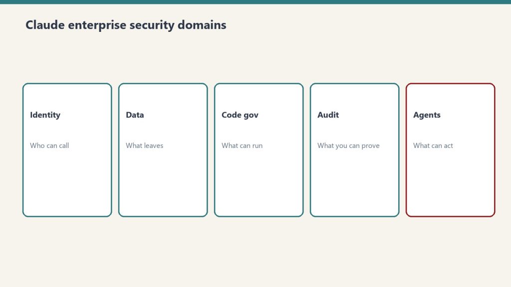
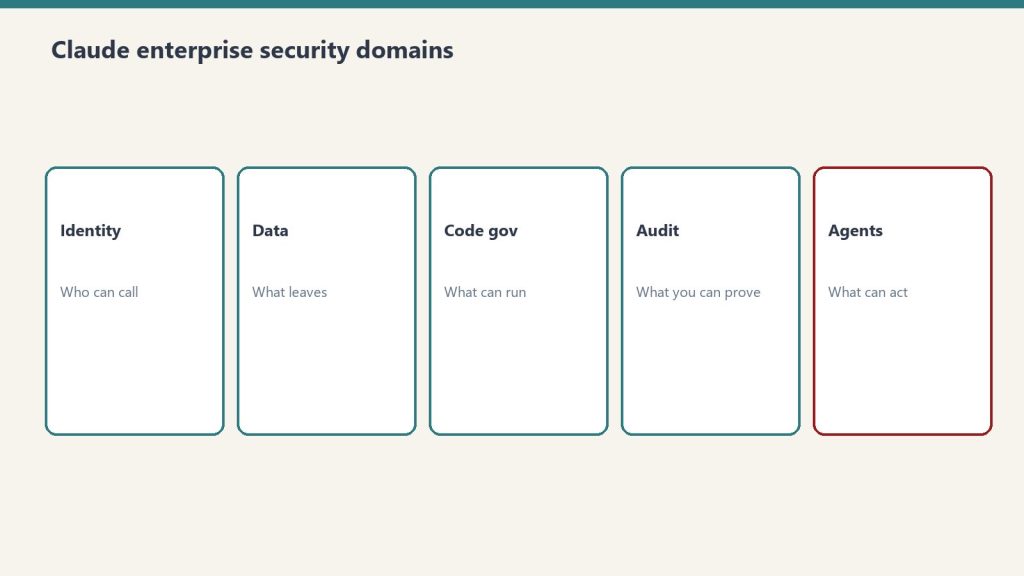
Anthropic has built guardrails into CMA — sandboxed execution, credential isolation, session logging — but the governance layer for reviewing agent output at enterprise scale is still largely unsolved. This is a space where internal operational discipline matters more than the technology itself.
Where This Goes Next
Claude Tag launched on Slack first. Anthropic has indicated plans for wider rollout beyond Slack. If the pattern holds, expect Claude Tag’s persistent team member model to appear in Microsoft Teams, Discord, and any other collaboration surface where teams coordinate work.
The CMA primitives are designed to be composable, which means the partner integration list will grow rapidly. Any SaaS company with an API and a workflow that involves reading context, making decisions, and taking actions is a candidate for CMA integration. Customer support platforms, CRM systems, design tools, analytics dashboards, HR systems — the addressable surface is essentially every tool that knowledge workers touch.
Gartner’s long-term projection estimates that agentic AI could drive approximately 30% of enterprise application software revenue by 2035, surpassing $450 billion. If Anthropic’s embedded strategy succeeds, a meaningful slice of that revenue flows through CMA as the underlying runtime — regardless of whose logo is on the interface.
The chatbot era is ending. The embedded agent era is starting. And Anthropic is betting that the company that owns the invisible execution layer wins the market, even if no end user ever sees its name.
Related on Tygart Media: Claude restraint & trust · Dario Amodei · how to use Claude.
Frequently Asked Questions
What are Claude Managed Agents (CMA)?
Claude Managed Agents is a set of composable APIs launched by Anthropic on April 8, 2026 in public beta. CMA lets developers build and deploy production AI agents on Anthropic’s cloud infrastructure, handling sandboxed code execution, session persistence, credential management, and end-to-end tracing. The architecture separates the “brain” (Claude reasoning) from the “hands” (code execution sandbox), enabling parallel processing and faster agent responses.
How much do Claude Managed Agents cost?
During the current public beta, CMA pricing is standard Claude API token rates plus $0.08 per session-hour of active runtime. Runtime is measured to the millisecond and only accrues while the agent is actively executing — idle time does not count. GA pricing has not been finalized and may differ from the beta rate.
What is Claude Tag in Slack?
Claude Tag is Anthropic’s persistent AI team member for Slack, launched in late August 2026. Unlike a traditional chatbot, Claude Tag lives in channels, builds memory across conversations, takes initiative through ambient mode, and works asynchronously. It is multiplayer — one Claude identity per channel that all team members interact with. Claude Tag now runs on Claude Opus 5.5 (launched on Opus 4.8) and is available on Enterprise and Team plans. It replaces the original Claude in Slack app, which retired August 3, 2026.
Which tools have Claude Managed Agents embedded?
As of October 2026, CMA is embedded in Slack (via Claude Tag), Notion (via the External Agents API), Asana (AI Teammates), Atlassian Jira (Claude Agent for Jira), and Sentry (extending the Seer debugging agent). Enterprise deployments include Rakuten (specialist agents across product, sales, marketing, and finance) and KPMG (Digital Gateway Powered by Claude for tax and private equity clients).
How does Anthropic’s agent strategy differ from OpenAI and Google?
Anthropic uses a tool-centric orchestration approach, embedding its agent runtime inside existing tools via composable APIs and the Model Context Protocol (MCP). OpenAI chose vertical integration with Workspace Agents, positioning ChatGPT as the central hub. Google chose platform depth with the Gemini Enterprise Agent Platform and Workspace Intelligence semantic layer. Anthropic’s approach does not require users to change platforms — the agent shows up where they already work.
What percentage of enterprise apps will have embedded AI agents by end of 2026?
Gartner predicts that 40% of enterprise applications will include embedded task-specific agents by the end of 2026, up from less than 5% in 2025. However, fewer than one in nine enterprises currently run agents in production at scale, suggesting significant growth ahead.
Can Claude Managed Agents run inside a private network?
Yes. CMA supports self-hosted sandboxes through partners including Cloudflare, Daytona, Modal, and Vercel, or custom VPC deployments. MCP tunnels allow agents to connect to private Model Context Protocol servers inside your network without public exposure. A Vaults system keeps credentials out of the sandbox using envelope encryption.