· Senior Advisory
· Operator-grade intelligence
Managing twenty-plus client sites from one Notion workspace requires solving a specific problem: how do you keep clients separated while keeping your operation unified? Separate workspaces per client sounds clean until you’re switching between eight workspaces to get a picture of the week. One shared workspace sounds efficient until a client can see another client’s work.
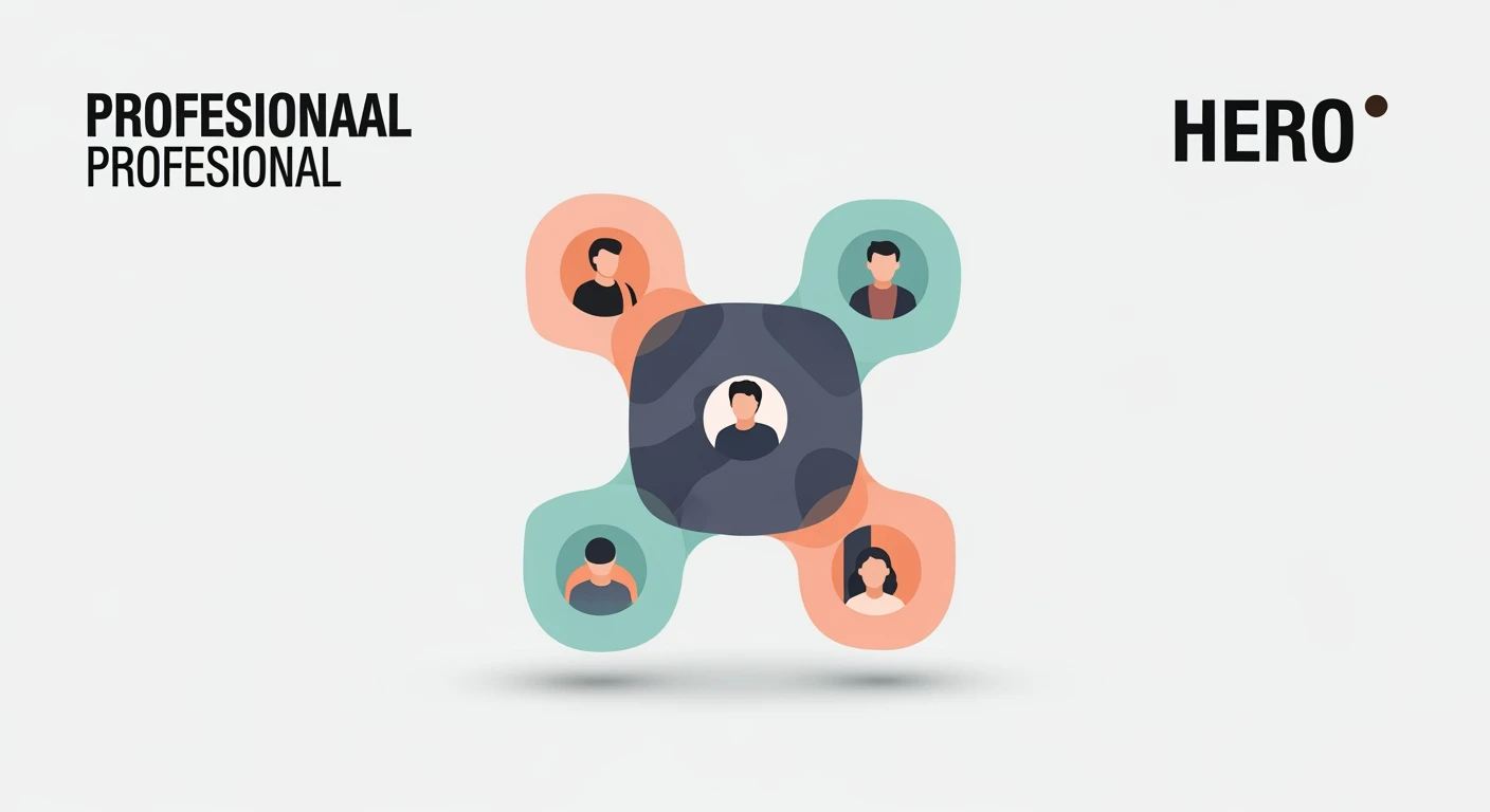
The answer is a single workspace with entity-level partitioning — one set of databases, one operating rhythm, one knowledge layer, with every record tagged to the entity it belongs to. Here’s how that works in practice for a content agency.
Why One Workspace Beats Many
The operational case for a single workspace is straightforward: weekly planning requires seeing everything at once. If Monday morning means answering “what’s publishing this week across all clients?”, the answer should come from one view, not from opening eight workspaces and aggregating manually.
A single workspace with entity tagging gives you that cross-client view. Filter by entity for client-specific work; remove the filter for the full operational picture. The same database serves both purposes.
The Content Pipeline at Scale
For a content agency, the Content Pipeline database is the operational core. Every article, audit, and deliverable across every client moves through the same status sequence — Brief, Draft, Optimized, Review, Scheduled, Published — in one database.
Each record carries the client entity tag, the target site URL, the target keyword, word count, publication date, and a linked task in the Master Actions database for whoever is responsible for the next step. A filtered view scoped to one client shows that client’s complete pipeline. An unfiltered view shows the full operation across all clients simultaneously.
The practical benefit: a Monday morning review of everything publishing in the next seven days across all clients is one database view, sorted by publication date. No aggregation, no manual compilation, no missing anything because it was in a different workspace.
The Client-Specific Knowledge Layer
Each client has unique constraints that govern the work: brand voice guidelines, keyword lists, approved topic areas, platform-specific rules, past decisions about what to avoid. This information needs to live somewhere accessible mid-session without requiring a search.
In our system, each client’s reference documentation lives in the Knowledge Lab database, tagged with the client entity. A filtered view of the Knowledge Lab scoped to one client shows all the reference material for that client — brand guide, keyword strategy, approved personas, content rules — in one place.
The critical piece: every client reference page carries the metadata block that makes it machine-readable mid-session. When working on a client’s content, Claude can fetch the client’s brand reference and style guide and read the key constraints from the metadata summary without reading the full document every time.
Communication and Decision Logging
At scale, the thing that creates the most operational problems is context loss between sessions: a decision made in a client call two weeks ago that wasn’t documented, a feedback note that lived in an email and never made it into the system, a constraint mentioned once and then forgotten.
The communication log in each client’s portal and the session log in the Knowledge Lab together solve this. Any significant decision — a strategic pivot, a content constraint, a scope change — gets a one-paragraph log entry with a date. The next session starts by reading the most recent log entries, not by trying to remember what was decided.
This is unglamorous work. It takes three minutes to write a decision log entry. Those three minutes prevent hours of re-work when the undocumented decision surfaces as a problem two months later.
The Weekly Cross-Client Review
The operational rhythm for a multi-client content agency requires one weekly moment of seeing the full picture: every client’s content queue, every stalled deliverable, every relationship that needs attention. This is the weekly review, and Notion’s filtered views make it tractable at scale.
The weekly review covers four database views: all content scheduled for the coming week sorted by publication date; all tasks marked In Progress for more than two days across all clients; any Revenue Pipeline deals with no activity in the past seven days; any client CRM contacts who should have heard from you. Reading all four views and deciding what needs action takes twenty to thirty minutes. Everything else in the week flows from those decisions.
We build multi-client Notion architectures for content agencies — the entity partitioning, content pipeline, knowledge layer, and operating rhythm that make managing twenty-plus clients tractable.
Tygart Media manages a large portfolio of client sites from a single Notion workspace. We know what the architecture requires at that scale.
Frequently Asked Questions
Should each client have their own Notion workspace?
For most content agencies, no. Separate workspaces per client prevent the cross-client visibility that makes weekly planning tractable. A single workspace with entity-level partitioning gives you unified operations for the agency and isolated views for any client-facing access. Separate workspaces make sense only when clients need active collaborative access to the same workspace — a rare requirement for most content agency relationships.
How do you prevent one client’s content from appearing in another client’s view?
Every database record carries an entity or client tag. Every client-facing view is filtered to show only records with that client’s tag. As long as records are correctly tagged at creation — which becomes habitual quickly — the filtering is reliable. A brief weekly audit checking for untagged records catches any that slip through.
What happens when a content agency grows beyond Notion’s capacity?
Notion handles large workspaces well with proper architecture — the performance issues most people encounter come from databases with thousands of unarchived records, not from the number of clients. Regular archiving of completed records keeps databases performant. At genuinely large scale (hundreds of active clients), dedicated agency management software may be warranted, but most content agencies operating at twenty to fifty clients run well within Notion’s capabilities.